
SM
Work
Resume
Let’s Talk
Bank of America: UX/UI Design
A user-centered redesign of Bank of America’s website to improve usability, clarity, and the overall digital banking experience.
“Explore how I reimagined the Bank of America website into a streamlined, intuitive experience—focused on reducing friction, improving navigation, and empowering users with clarity at every step.”
My Role
UX/UI Designer

Timeline
10 Weeks (Academic)

Team
2 Designers, 1 Mentor

A Quick Summary
What I Did
Led the end-to-end UX redesign — from heuristic analysis and research to wireframing, mid-fidelity prototyping, and usability testing. Responsible for design decisions, flow simplification, and visual clarity.


How I Approached It
The website was functional but cluttered, inconsistent, and visually outdated. Navigation was confusing, key tasks were hidden, and the interface lacked hierarchy or trust-building clarity.


What I Changed
Used a combination of heuristic evaluation, user interviews, competitive analysis, and cognitive walkthroughs to identify pain points. Redesign was focused around three key tasks.


Visual Anchors
Simplified layouts, restructured flows, improved visual consistency, and added progress cues and contextual clarity. Designed modern UI with accessible interactions and smooth task completion paths.


What Got Better
Improved navigation, increased user clarity, and reduced confusion across primary tasks. Users felt more confident using the redesigned interface and completed tasks with less hesitation.


Context and Motivation
Why Bank of America Matters
Bank of America is one of the largest financial institutions in the United States, serving over 67 million users. As a long-standing player in the banking sector, it handles everything from everyday transactions to life-changing decisions — making its digital platform a critical part of millions of people’s routines.
Its scale, reach, and impact make even small UX improvements carry significant weight.
What Prompted This Redesign
Despite its functionality, the website had not undergone a meaningful redesign in years. Through personal use and user interviews, I discovered that many core experiences — from fund transfers to appointment booking — were confusing, outdated, and inconsistent.
This friction led to frustration, especially for users unfamiliar with legacy flows. It sparked a deeper look into how design could rebuild clarity, trust, and ease into the experience.
Importance of Inclusive and Intuitive Design
Banking should feel empowering — not intimidating. But the platform lacked accessibility, used inconsistent layouts, and buried important features, creating barriers for users with varying levels of tech confidence.
This redesign focused on building an experience that was inclusive, intuitive, and responsive to real-world user needs, especially those who may not be digital natives or who rely on the site for vital daily tasks.
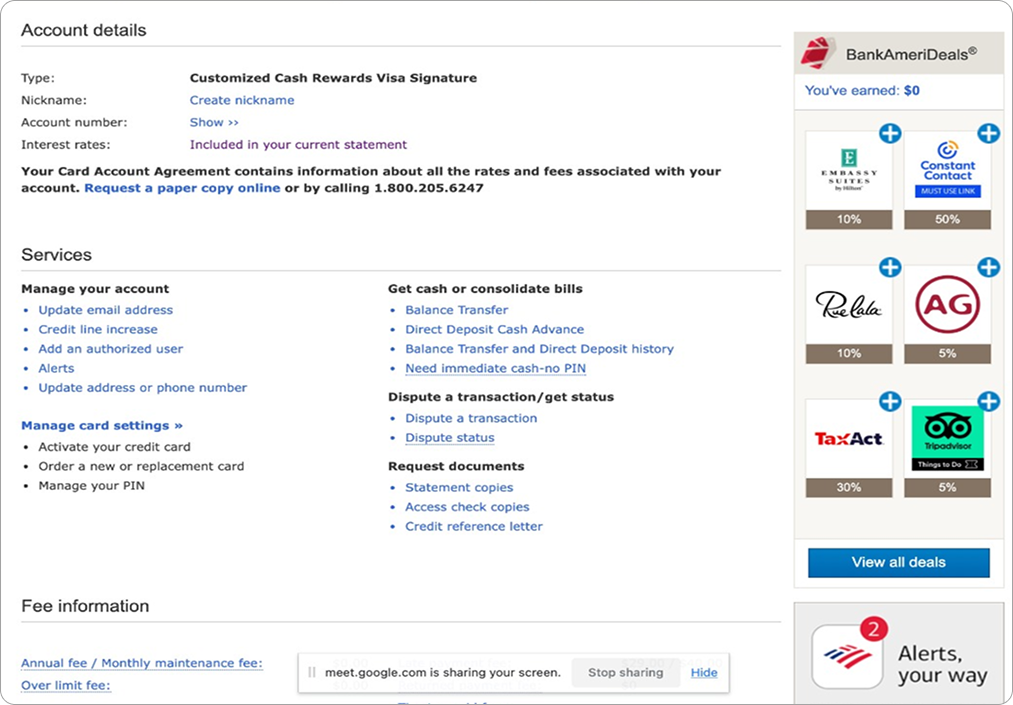
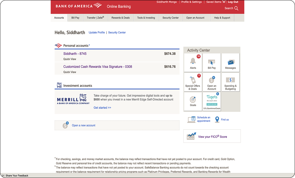
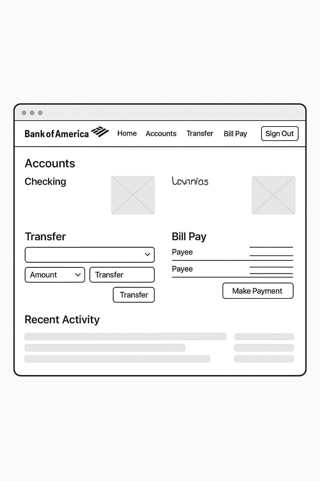
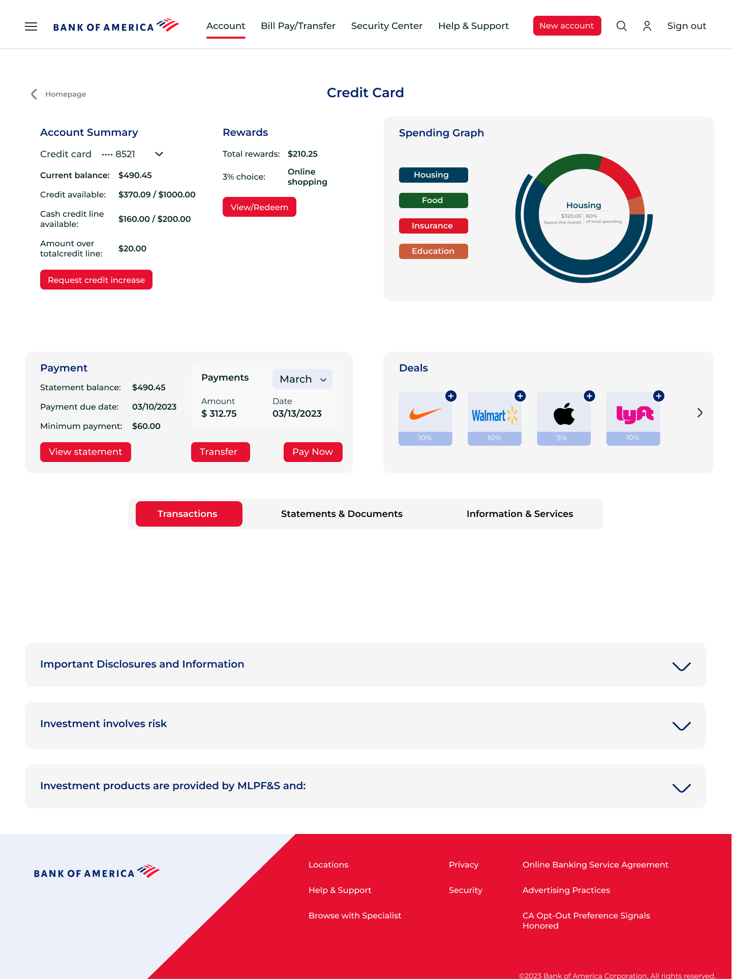
What was Broken
Cluttered Layouts
Information was overwhelming and scattered. Pages felt dense, with little visual hierarchy, making it hard to focus or navigate confidently.
Inconsistent Design
Fonts, element spacing, and button placements varied across pages. This made it difficult to build a mental model of the interface.
Confusing Task Flows
Actions like transferring funds, scheduling appointments, or finding account details often involved redundant steps or unclear pathways.
Poor Accessibility
Key interactive elements lacked clarity. The non-clickable logo and inconsistent button styles made basic navigation frustrating.
No Feedback or Guidance
There was little feedback for user actions. Error states were vague, and there was no guidance for first-time users or complex flows.
A Closer Look at the UX Process
Research Insights
I began with heuristic evaluation and user interviews to identify real-world friction. Key issues surfaced around navigation clarity, content hierarchy, and lack of feedback during tasks.
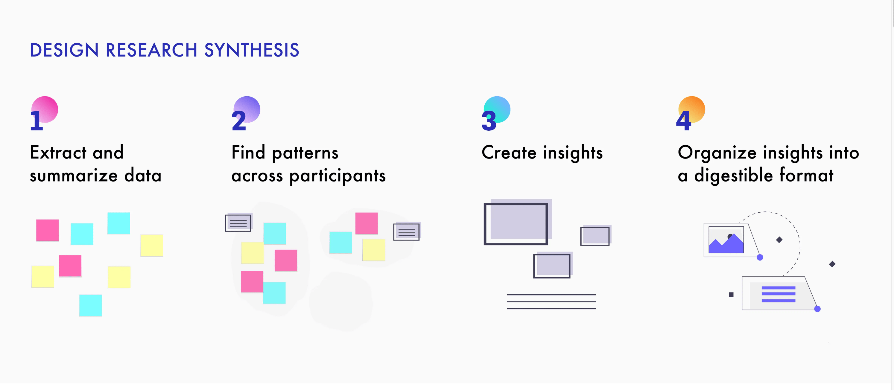
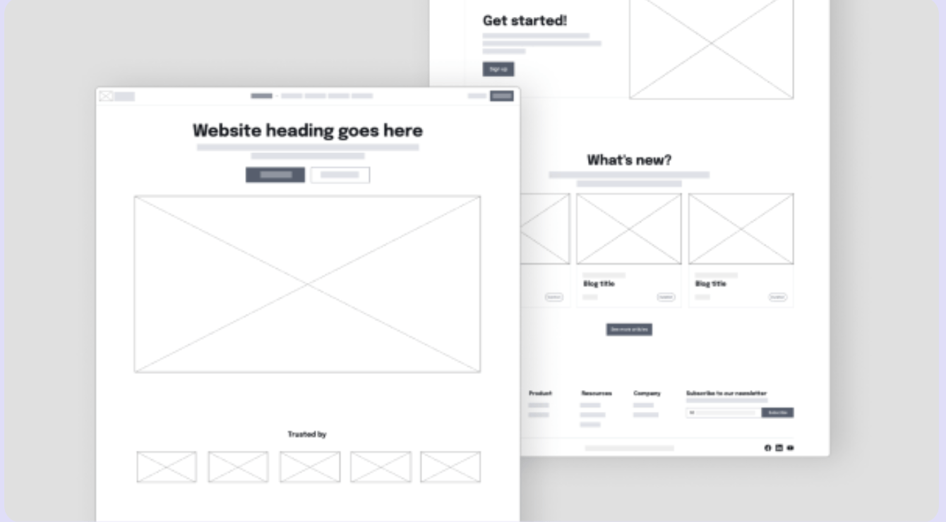
Low-Fi Ideation
I translated research insights into wireframes, sketching possible flows and layout structures. The goal was to simplify complexity before adding fidelity.
Mid-Fi Decisions
From sketches, I moved into mid-fidelity design. This helped me define component structure, hierarchy, and layout consistency. Focus remained on clarity, accessibility, and reducing cognitive load.
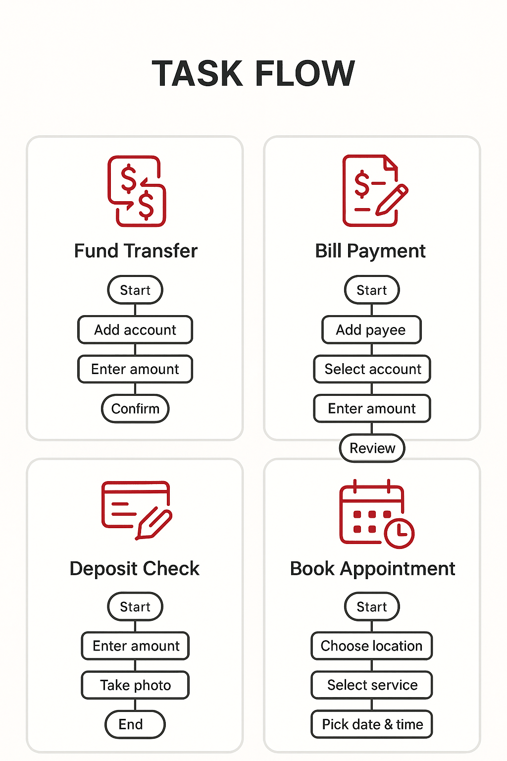
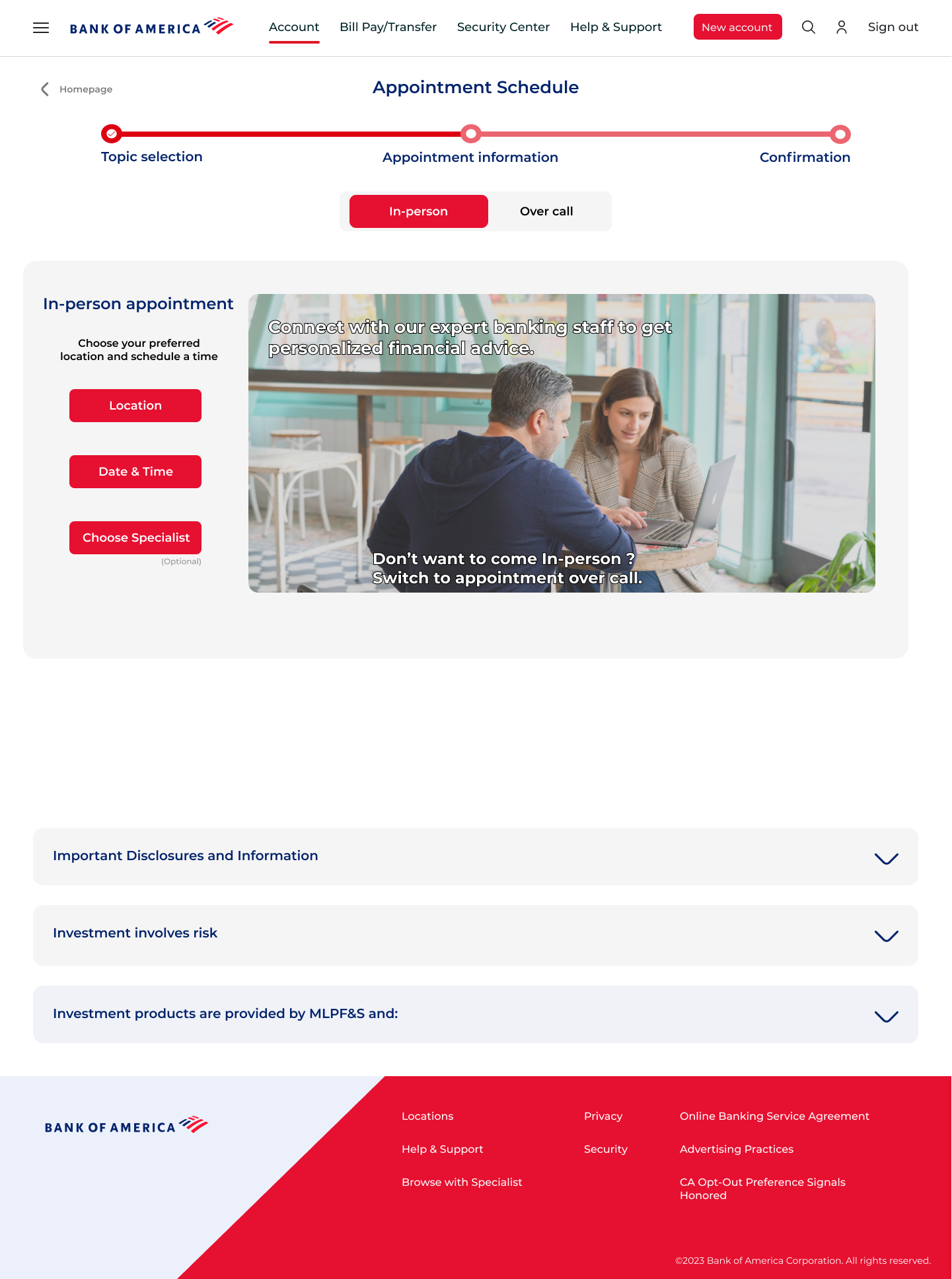
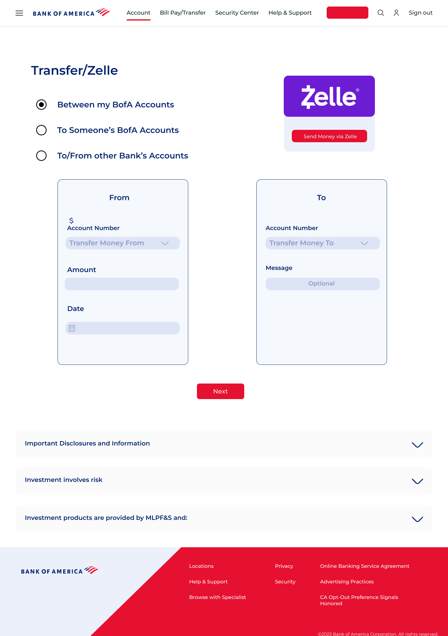
Task Flows (3 Key Tasks)
- Fund Transfer
- Viewing Account Summary
- Booking an Appointment
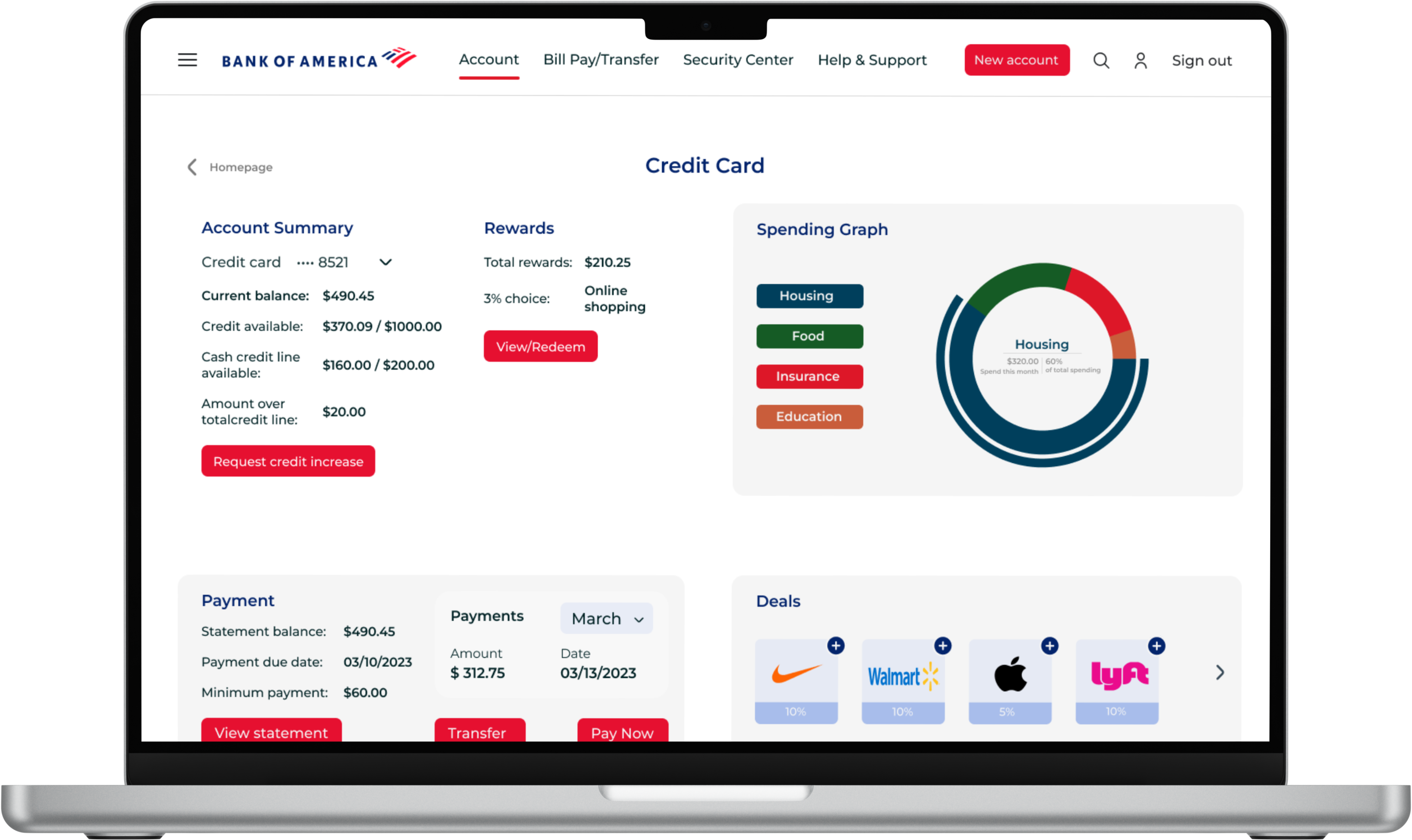
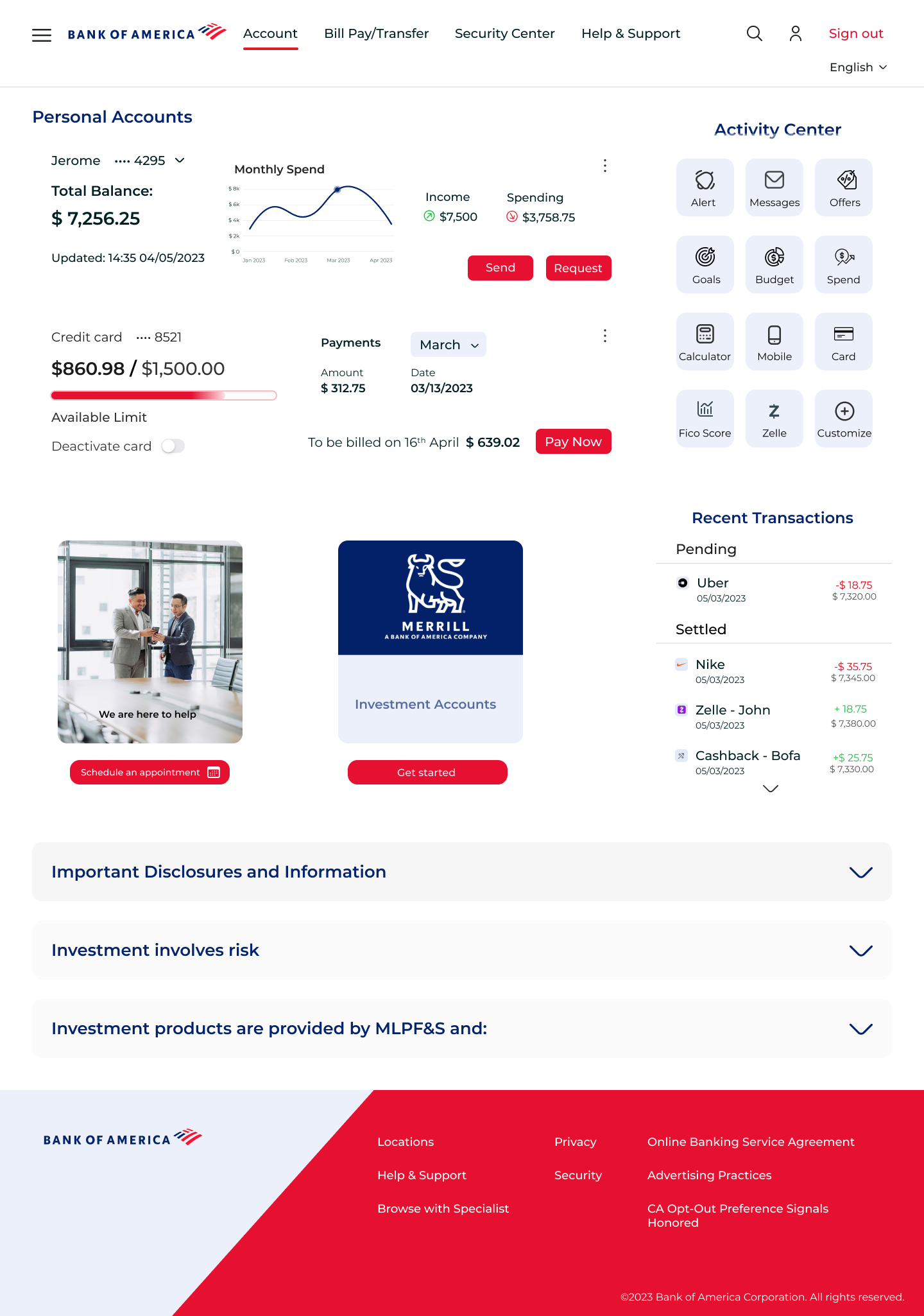
Updated UI Design
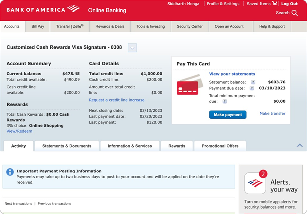
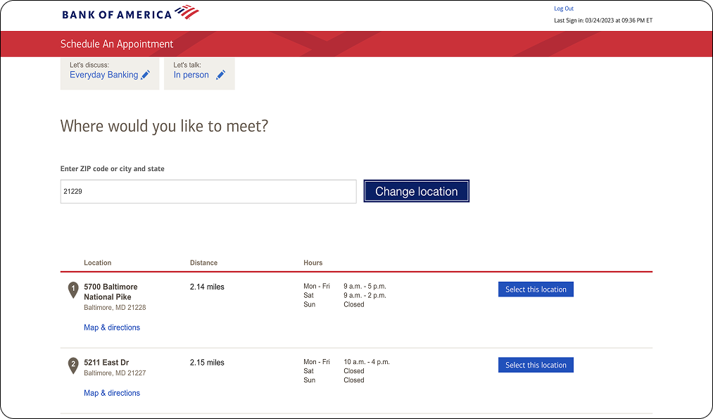
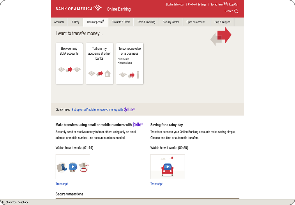
Each of the following screens was reimagined to reduce friction, improve clarity, and build a more intuitive experience. Here's how the redesigned interface compares to the original.
Usability Testing & Feedback
Feedback from diverse users helped me uncover blind spots and refine usability. It highlighted the value of progressive disclosure, clean hierarchy, and small visual cues.
Task
- Viewing Account Info
- Fund Transfer Flow
- Appointment Scheduling
Changes Made
- Added graphs and improved info hierarchy
- Replaced arrows with dual account selection tiles
- Merged steps into 3 screens + progress bar
Insights
- Users wanted quick access to monthly trends
- Arrows between "To" and "From" were confusing
- Too many steps, unclear progress
Results
The redesign simplified key flows like fund transfers and scheduling. It reduced user hesitation and improved visual clarity — especially for new users. Users now move through tasks with more confidence and less friction.
Lessons Learned
This project reinforced the power of small UX decisions — how alignment, spacing, and clear feedback shape the entire user experience. I also learned to balance research, structure, and visual storytelling to make complex tasks feel simple.
Future Improvements
If given more time, I’d explore responsive design for mobile, test high-fidelity prototypes with a broader range of users, and integrate meaningful micro-interactions to support real-time feedback and delight.
Reflection and Final Impact
Thanks for reading!
If this case study resonated with you, I’d love to connect and chat more. Feel free to reach out.
Siddharth Monga
Designing with empathy, clarity, and intent.