Care Labs

A health insurance literacy platform co-designed with international students at UMBC. Researched, built, and published at AMIA 2024.

Role

UX Researcher

timeline

Jan - Oct 2024

Published at

AMIA 2024

UX Research

Mixed Methods

Co-design

Participatory Design

Health Informatics

Peer- Reviewed Publication

Context

A system nobody taught them to use

A system nobody taught them to use

A system nobody taught them to use

International students make up 57% of UMBC's graduate population. Every one of them arrives in the US having to navigate a health insurance system built on jargon, fragmented billing, and the assumption that you already know how it works.

Prior research had documented the confusion. Nobody had sat down with the students themselves and asked them to design the solution.

That's what Care Labs set out to do — a three-phase study that moved from broad survey data, through in-depth listening sessions, into co-design workshops where students built the platform concept themselves.

57%

57%

of UMBC grad students are international

of UMBC grad students are international

2.83/5

2.83/5

average self-reported understanding of US health insurance

average self-reported understanding of US health insurance

4

4

countries represented across sessions (India · Nigeria · Bangladesh · Iran)

countries represented across sessions (India · Nigeria · Bangladesh · Iran)

Research Arc

Three phases. One north star.

Each phase informed the next. Survey data shaped the interview questions. Interview findings shaped the co-design workshops. The workshops shaped the platform.

Phase 01
Survey
Quantitative · Anonymous

Distributed to all UMBC international students to understand baselines before forming any assumptions.

49survey respondents
20questions across enrollment, confusion, and modality preference
14agreed to participate in co-design sessions
Goal — understand the landscape before we formed any assumptions.
Phase 02
Listening Sessions
Qualitative · Deductive Thematic Analysis

In-depth sessions designed to surface the human stories that numbers can't capture. No interviewer hierarchy — every voice equal.

6listening sessions
4countries — India, Nigeria, Bangladesh, Iran
4themes from Braun & Clarke thematic analysis
Goal — surface what data alone would never find.
Phase 03
Co-Design Workshops
Participatory Design · Lo-fi Prototyping

Students identified problems, brainstormed solutions, and sketched prototypes themselves. Designed by the people it's for.

4–5participants per session
3stages — problems, solutions, sketches
Lo→Hiiterated to hi-fi with usability testing
Goal — let the people it's for design it.
Phase 01 · Survey

Start wide. Learn fast.

A 20-question survey distributed to all UMBC international students before we formed a single hypothesis. 39 responses. The data confirmed some things — and broke others.

Understanding scale · Q13
Most confusing aspects · Q15
Preferred modality · Q16
2.83/5
average self-reported understanding of US health insurance
49 respondents
#1
most confusing — what's actually covered under your plan
above billing, jargon, and enrollment
34%
chose affordability as the top factor in picking insurance
coverage options second at 21%
14
participants agreed to join co-design sessions
recruited directly from this survey
Phase 02 · Listening Sessions

What data doesn't tell you.

We chose listening sessions over traditional interviews deliberately — no interviewer hierarchy, every voice equal. Six sessions. Participants from India, Nigeria, Bangladesh, and Iran. Four themes emerged across all of them.

Co-design workshop session at UMBC
Co-design workshop · UMBC Campus · 2024
The detail that changed everything
One participant arrived with a year's supply of medications packed in his luggage — antibiotics, fever reducers, cold medicine. Not because he was cautious. Because the same drugs cost up to 10x more at a US pharmacy.
That detail wasn't in any brief. It surfaced because we listened long enough for people to tell us the real story.
Four themes from thematic analysis
01
Frustrating billing processes
Bills from different providers arrived separately. When one participant moved apartments, a bill got lost — and he had no way to find or pay it.
02
Confusion about in-network providers
Students didn't know they needed a referral to see a specialist. They discovered this when they were already sick and needed one.
03
Difficulty finding plan information
Plans offered little to no clear description of what was covered. Students enrolled in whatever was cheapest and hoped it would be enough.
04
Distrust of insurance representatives
None of the participants relied on official channels. All of them turned to their seniors — older international students who'd already been through it.
Phase 03 · Co-Design Workshops

Designed by the people it's for.

Instead of designing for students based on what we'd found, we designed with them. Each session had 4–5 participants working through three stages — identifying problems, brainstorming solutions, then sketching a technology to address them.

Co-design workshop session
Co-design session · UMBC Campus · 2024
What students asked for
01
Side-by-side plan comparison
Not buried in a PDF. A simple visual table: here's what Plan A covers, here's what Plan B covers, here's the price.
02
Plain-English glossary
Insurance terms explained with examples, not definitions. "Your deductible is $500 — that means you pay the first $500 before your insurance pays anything."
03
A "what does my plan cover" dashboard
The single most confusing question had no clear answer anywhere. Students wanted one place to look.
04
Walk-through tutorials for common scenarios
First dentist visit. How to get a referral. How to file a claim. Step-by-step, plain language, for someone who's never done it before.
05
A community forum
Students trusted seniors, not representatives. So build that into the platform — a space where students who've been through it can answer questions for those who haven't.
Lo-fi sketches from the sessions
Student sketch · Flow diagram
Student sketch · Feature ideation
Student sketch · UI patterns
Published & Presented

Research rigorous enough to peer-review.

The study was written up, submitted, accepted, and presented at AMIA 2024 — the American Medical Informatics Association annual conference, one of the most selective venues in health informatics. Also presented at COEIT, UMBC's College of Engineering and IT Research Symposium.

Publication
AMIA 2024
COEIT 2024
"Increasing Health Insurance Literacy Among International Students: preliminary results of user-centered design study"
Rachael M. Kang · Siddharth Monga · Neel Bhesaniya · Mohammad Arashad · Tera L. Reynolds PhD
University of Maryland – Baltimore County
Most UX portfolios show app redesigns with self-reported metrics. This research was reviewed by external academics before it was accepted. The rigour wasn't declared — it was validated.
AMIA 2024 conference poster
Presented at AMIA 2024 · American Medical Informatics Association Annual Symposium
Prototype · UMBC Compass

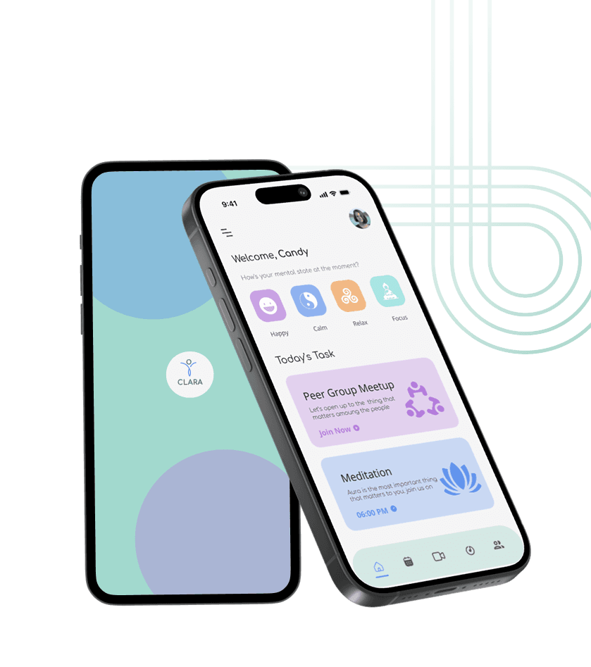
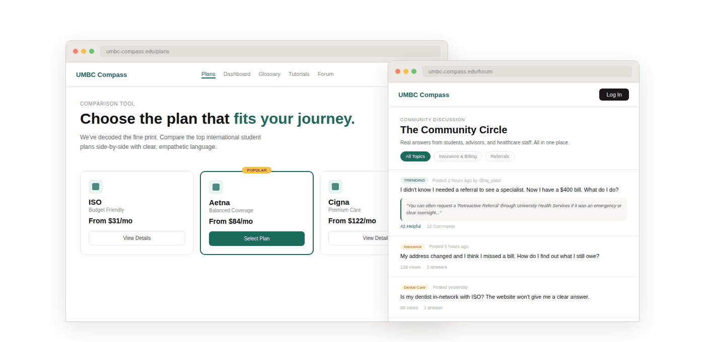
From research to interface.

Five screens. Each one traces directly back to a finding from the survey, listening sessions, and co-design workshops. This is what the research recommended building.

01
Plan comparisonStudents compared plans across multiple tabs
Research finding →
Plan comparison
02
Coverage dashboard"What's covered" was the #1 most confusing question
Research finding →
Coverage dashboard
03
Plain-English glossaryInsurance jargon was a consistent barrier
Research finding →
Plain-English glossary
04
Walk-through tutorialStudents discovered referrals only when they needed one
Research finding →
Walk-through tutorial
05
Community forumStudents trusted seniors over official representatives
Research finding →
Community forum
Research handoff
UMBC Compass represents the design recommendations from the Care Labs research study — co-designed with international students at UMBC and validated through participatory design workshops. Published at AMIA 2024.
What this taught me

Research is only as good as what you do with it.

01
`Most research stops at findings. We went further — let students define the problems, shape the solutions, and sketch the prototypes themselves. The result wasn't just a platform concept. It was a process that put the most affected people in the room with the most decision-making power.`
02
`The detail that stayed with me most wasn't in the data. It was the student who packed a year's worth of medications in his luggage because he couldn't afford the US equivalent. That's the moment that made the whole study feel urgent.`
03
`A peer-reviewed publication is a different kind of proof. It means external researchers looked at your methodology, your findings, and your conclusions — and agreed they held up. For a UX researcher, that's a bar worth clearing.`

Next project