Bank of America
Redesigning one of America's most used banking websites.
Role
UX/UI Designer
timeline
10 Weeks
The Problem
A platform built for scale — not for people.
Bank of America is one of the most widely used banking platforms in the United States — and the primary bank for millions of international students. But despite serving 67 million customers, the website hadn't seen a meaningful redesign in years. The interface was functional. But it was frustrating — especially for users who weren't already familiar with the system.
01
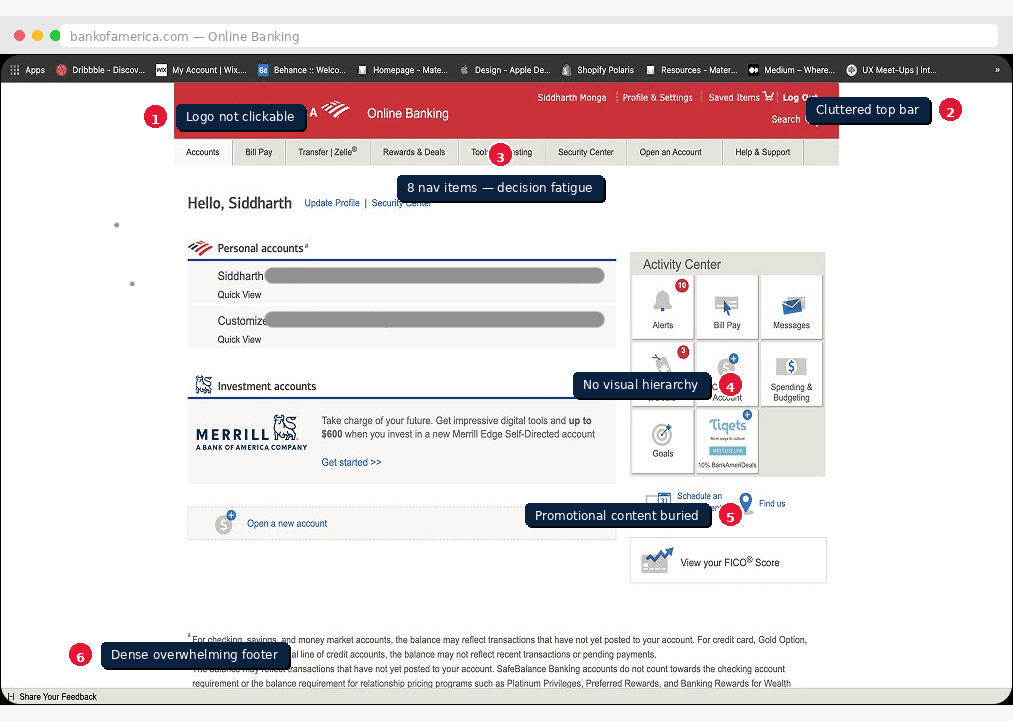
Inconsistent Design
Fonts, spacing, and layouts varied wildly across pages — making it impossible to build a mental model of the interface.
02
Non-Clickable Logo
The BofA logo didn't navigate home — a basic usability expectation broken on every single page of the site.
03
Confusing Navigation
Multiple paths to the same task — especially bill payments — created decision fatigue and wasted time.
04
No Customization
Users couldn't surface the features they used most. Everything was buried equally with no way to prioritize.
05
Poor Visual Balance
Dense content with no visual hierarchy made pages feel overwhelming — especially for less tech-savvy users.
06
Overwhelming Content
Account and credit card pages packed too much information into too little space with no clear focal point.
Research Snapshot
Finding the friction before fixing it
Bank of America is one of the most widely used banking platforms in the United States — and the primary bank for millions of international students. But despite serving 67 million customers, the website hadn't seen a meaningful redesign in years. The interface was functional. But it was frustrating — especially for users who weren't already familiar with the system.
67M+
Customers on a platform that hadn't been meaningfully redesigned in years
5
Research methods used to uncover real user friction
6
Critical usability problems identified through heuristic evaluation
5
Users tested across 2 rounds of cognitive walkthroughs
What Was Broken
We didn't rely on assumptions. Each method was chosen to surface a different layer of friction — from observable behaviour to systemic design gaps.
👁️
Observations
Watched 4 users complete core tasks in real time — capturing navigation patterns, hesitation points, and workarounds.
🎙️
User Interviews
Interviewed 2 existing BofA users with open-ended questions to understand frustrations, mental models, and unmet needs.
🗒️
Scenarios & Task Analysis
Defined 2 primary scenarios — fund transfer and appointment scheduling — to map the full task flow end to end.
🏦
Competitive Analysis
Benchmarked BofA against 5 competitor banks including Chase and PNC — identifying missing features and superior patterns.
📊
Heuristic Evaluations (UAR)
Conducted a structured usability aspect report — rating each problem by frequency, impact, and persistence to prioritise fixes.
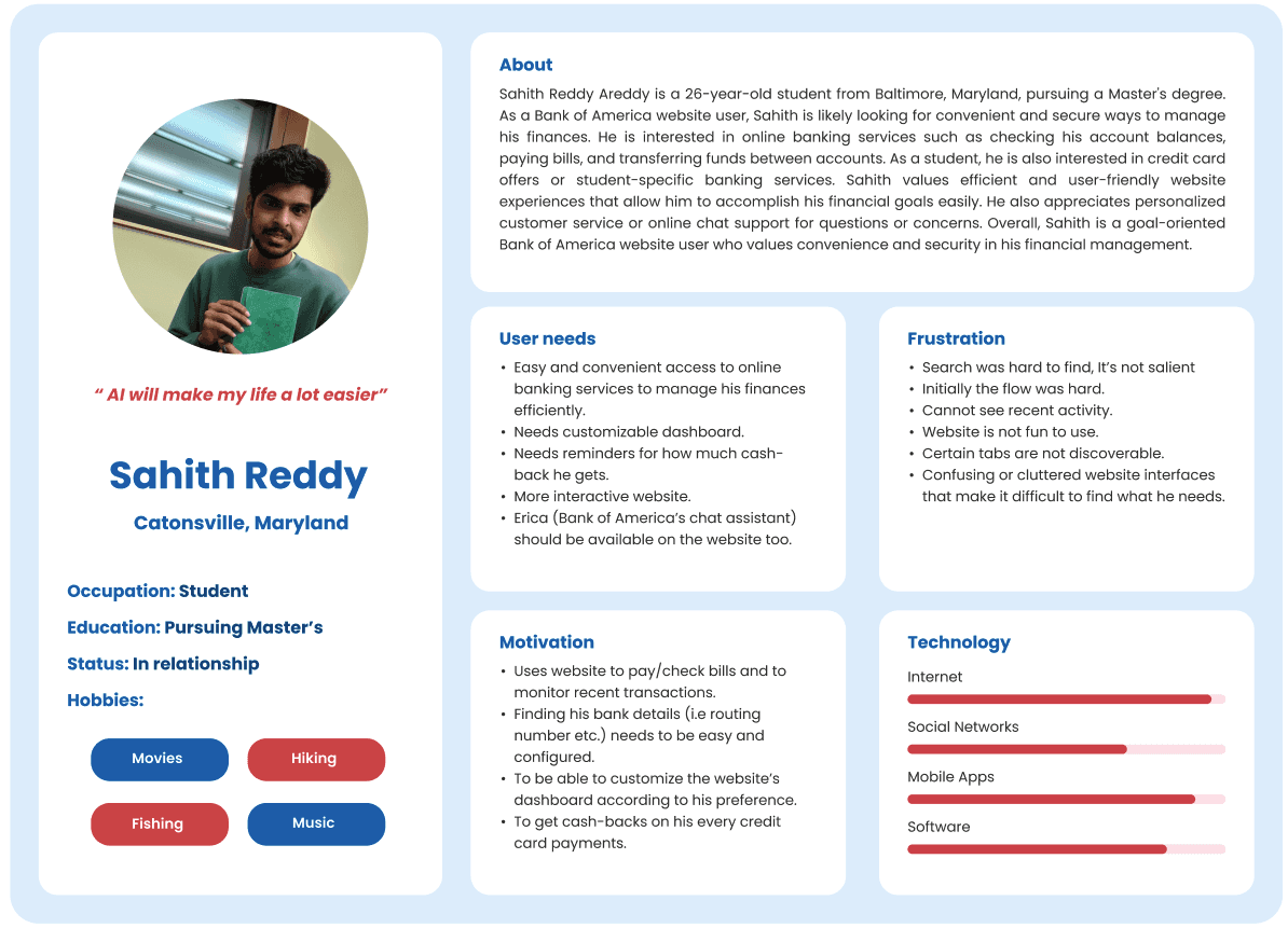
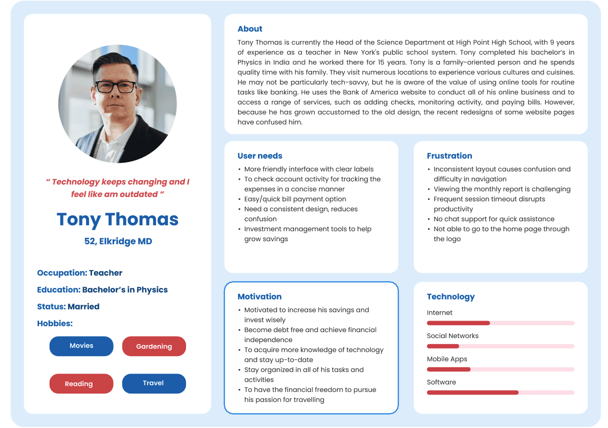
Intended Users
Designing for real people, not assumptions
We created two personas that represented the full spectrum of BofA's user base — from someone who calls the bank rather than using the website, to someone who uses every feature available.
Design Decisions
Every choice had a reason
Good design isn't just about how it looks — it's about why it looks that way. Here's the thinking behind the most important decisions we made, from brand identity to task flow structure.
Key Decision
Existing: BofA Red #e31837
Familiar but carries urgency — not ideal for calm UX
Decision: Blue #2b5eb8
Modern, calm, approachable — builds digital trust
Added: Navy #032169
Depth and hierarchy for typography
3 Task Flows — Lo-fi to Hi-fi
Task 01 — Account Dashboard & Credit Card View
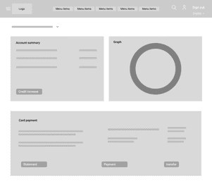
Lo-Fi Sketch
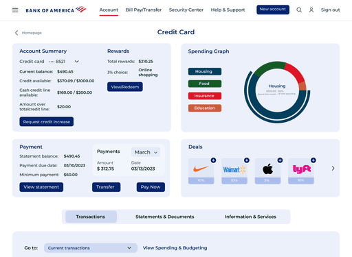
Hi-Fi Screen
Recent transactions on homepage
Most-checked information was buried 2 pages deep. Brought it to the surface.
Added income + spending summary
Users needed monthly context at a glance — not just a balance number.
Credit card progress bar
Replaced raw numbers with a visual indicator of credit utilisation — faster to read.
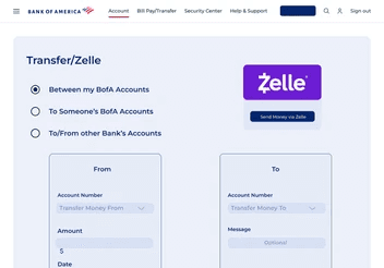
Task 02 — Money Transfer
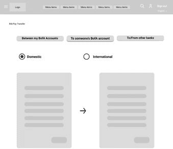
Lo-Fi Sketch
Hi-Fi Screen
Replaced arrows with account tiles
Users confused arrows for buttons. Dual tile layout makes From/To selection unambiguous.
Simplified to one screen
Original flow had 5+ steps. Consolidated into a single form with OTP confirmation.
Clear transfer type selector
Between BofA accounts, other banks, and Zelle — each option now has its own distinct path.
Task 03 — Appointment Scheduling
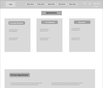
Lo-Fi Sketch
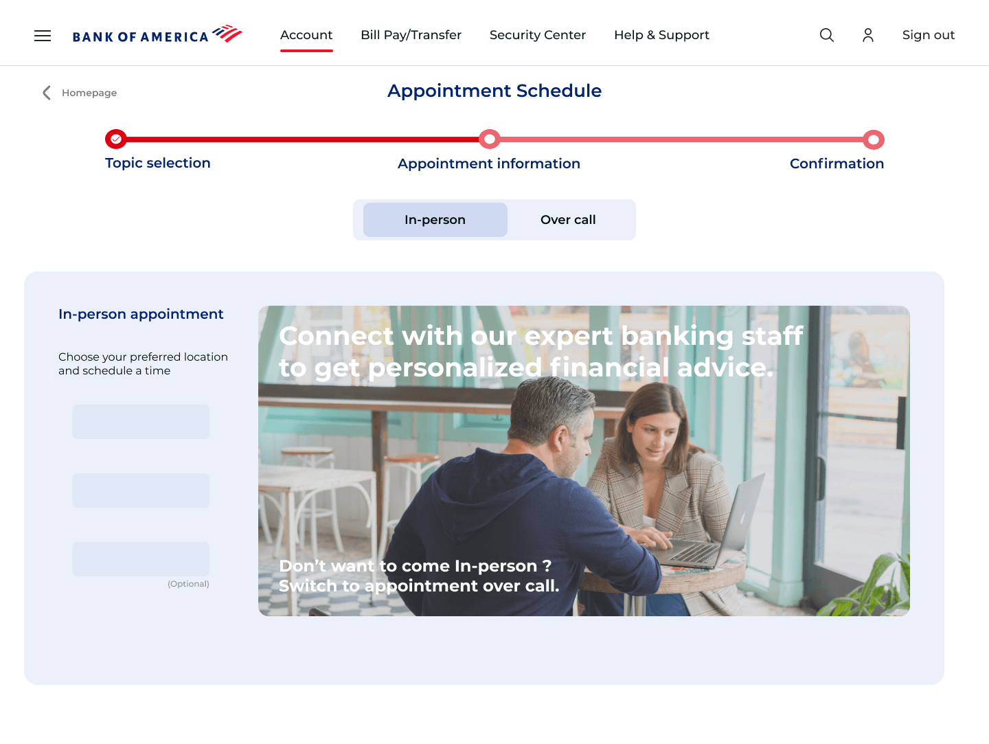
Hi-Fi Screen
Topic cards replace dropdown
Visual topic cards are faster to scan than a dense dropdown with 10+ options.
Map-integrated location picker
Users wanted to see branch proximity visually — not just a list of addresses.
Progress bar across 3 steps
No feedback during the original flow left users unsure how far along they were.
Key Screens
The redesign, up close.
Three tasks. Three flows rebuilt from scratch. Here's what the final design looks like — and the thinking behind each screen.
Account Dashboard
From cluttered overview to clear command centre
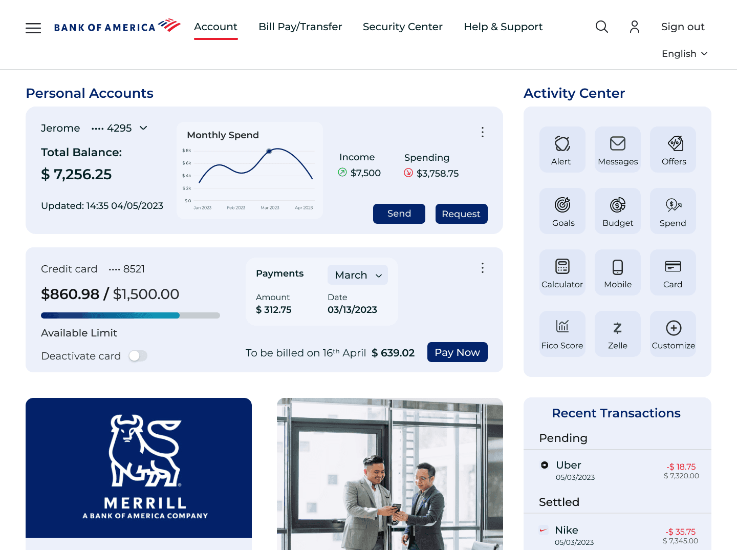
What changed: Balance, spending summary, credit card utilisation bar, and recent transactions — all surfaced on one page. No more digging.
Appointment Scheduling
From a buried feature to a guided experience
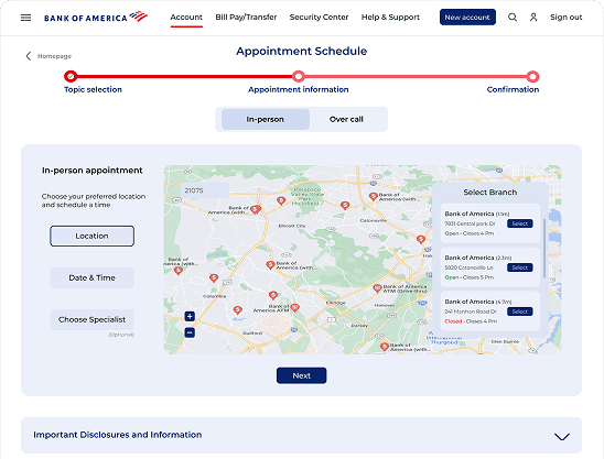
What changed: Topic cards replace a dense dropdown. Map shows branch proximity visually. Progress bar keeps users oriented across 3 steps.
Money Transfer
From confusing flow to one clean form
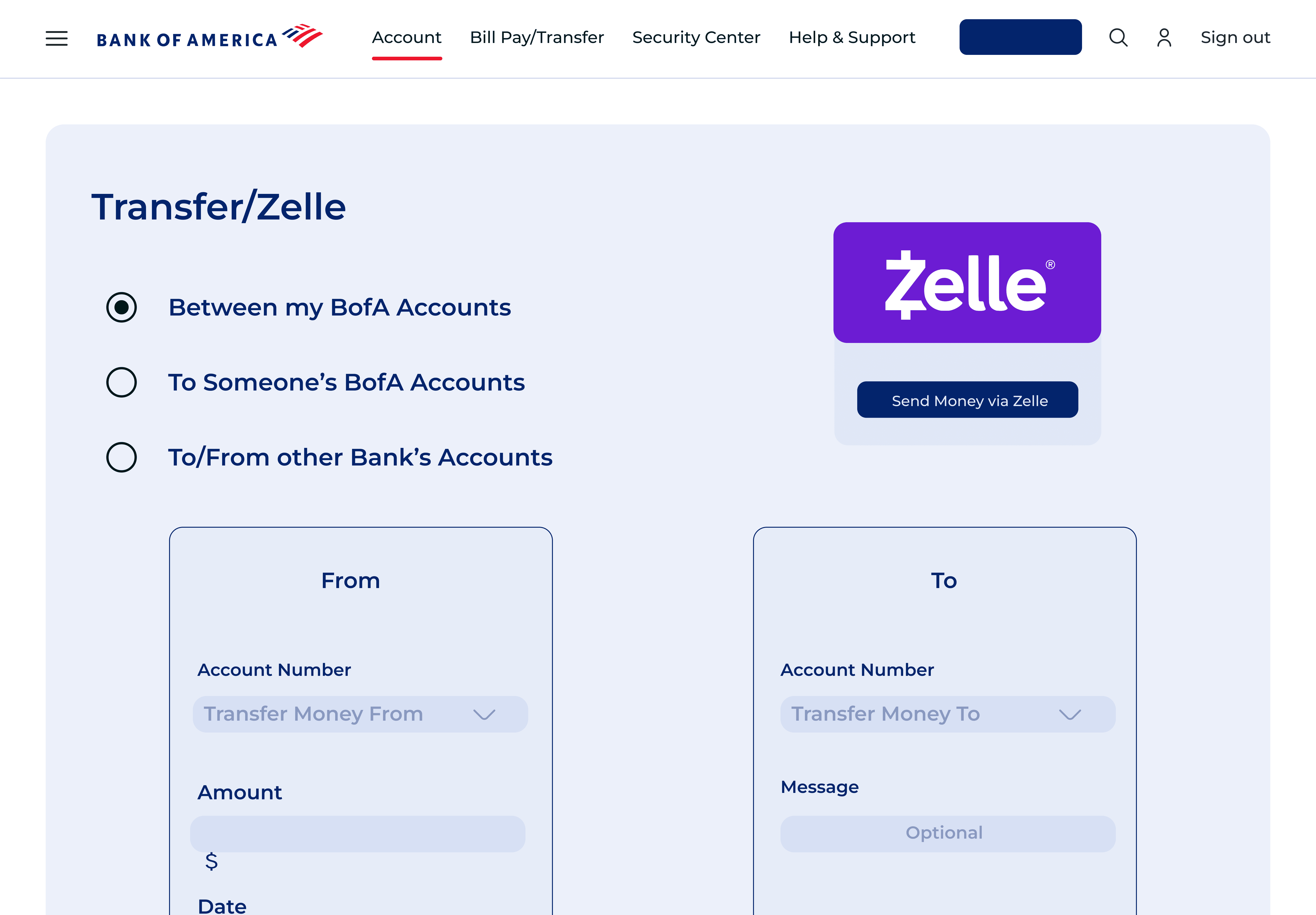
What changed: Arrows replaced with explicit account tiles. 5 steps consolidated into one screen. Transfer type — BofA, other banks, Zelle — each has a clear distinct path.
Outcome & Recommendations
What we learned. What changed.
After two rounds of cognitive walkthroughs with real users, the redesign showed clear improvement across all three task flows. Here's what the testing revealed — and what we'd do next.
Both test users — Tony and Sahith — successfully completed account viewing, fund transfer, and appointment scheduling without critical errors in the redesigned flow.
Users no longer hesitated at the homepage. The restructured dashboard surfaced the right information immediately — reducing time spent searching for basic account info.
Qualitative feedback showed users felt less anxious completing transfers. The explicit account tiles and OTP confirmation gave clear signals at every step of the flow.
Each round of testing directly changed the design. The transfer tile selector, the progress bar, and the topic cards all came from user feedback — not assumptions.
Recommendations for next iteration
What we'd do differently next time: This was an academic project with a 10-week timeline. With more time and access, here's where we'd take the redesign further.
1
Customisable dashboard
Users wanted to pin their most-used features. An Activity Centre with drag-and-drop personalisation would directly address this.
2
More user interviews
We interviewed 6 users. A broader sample — especially older users and non-English speakers — would surface additional friction points we likely missed.
3
Accessibility audit
Colour contrast, screen reader compatibility, and keyboard navigation weren't fully tested. A dedicated accessibility pass would be the next priority.
4
Mobile-first redesign
The redesign focused on the desktop web experience. Given how many users access banking on mobile, a native app redesign is the logical next step.
Personal Reflection
This was the most process-intensive project I'd done — and the most revealing. The biggest lesson wasn't about design. It was about listening. The arrow-vs-tile problem on the transfer screen wasn't something we anticipated. A user pointed it out in 30 seconds of testing. That single observation changed our entire approach to the transfer flow.
What We'd Improve
Research before wireframes
Jumping to solutions before understanding the problem adds weeks of rework. Every assumption we tested saved us time later.
Test with the right users
ony and Sahith represented opposite ends of the spectrum. Designing for both forced us to make decisions that worked universally — not just for power users.
Small fixes, big impact
The most impactful changes weren't the visual redesign — they were fixing the non-clickable logo, simplifying the nav, and surfacing transactions. Simple. Obvious in hindsight.
That's a wrap on Bank of America
Liked what you saw?
Whether you want the full story... or Just want to say Hello
I'd Love to hear from you