GreyOrange
GreyOrange builds autonomous robots for warehouse fulfillment. I redesigned the tools that people running those warehouses use every day.
Role
UX Designer
timeline
Jun- Sep 2025
B2B
SaaS
Enterprise UX
Field Research
Accessibility
Design System
Prototyping
Figma
Data Visualisation
Systems Thinking
A redesign of three operational workflows across GreyOrange's warehouse management system — built from field research at a live DHL fulfilment site.
1
Operator Flow
Pick station operators managing bot arrivals, task queues, and real-time delays
2
Robot Technician Flow
Field technicians diagnosing, locating and resolving malfunctioning bots on the floor
3
Fullfillment Flow
End-of-line staff tracking tote arrivals, package delays and order completions
Context
GreyOrange's warehouse management system runs 20 hours a day, shutting down only between midnight and 4am. The fleet runs two bot types — RMS bots for picking, available in small and large rack sizes, and RTP bots for sorting and transport. With 700+ bots active on a single floor, the cost of poor UX isn't a design problem. It's a throughput problem.
The Scale of the Problem
700+
Rangers active on a single floor
Two bot types — RMS for picking and RTP for sorting. Each with distinct behaviours and error patterns.
20 hrs
Daily operations
The warehouse runs midnight to 4am shutdown only. All design, research, and iteration had to happen around live operations.
3
User roles with broken workflows
Operators, robot technicians, and other staff, each with completely different needs, all underserved by the same system.
Workflow 1
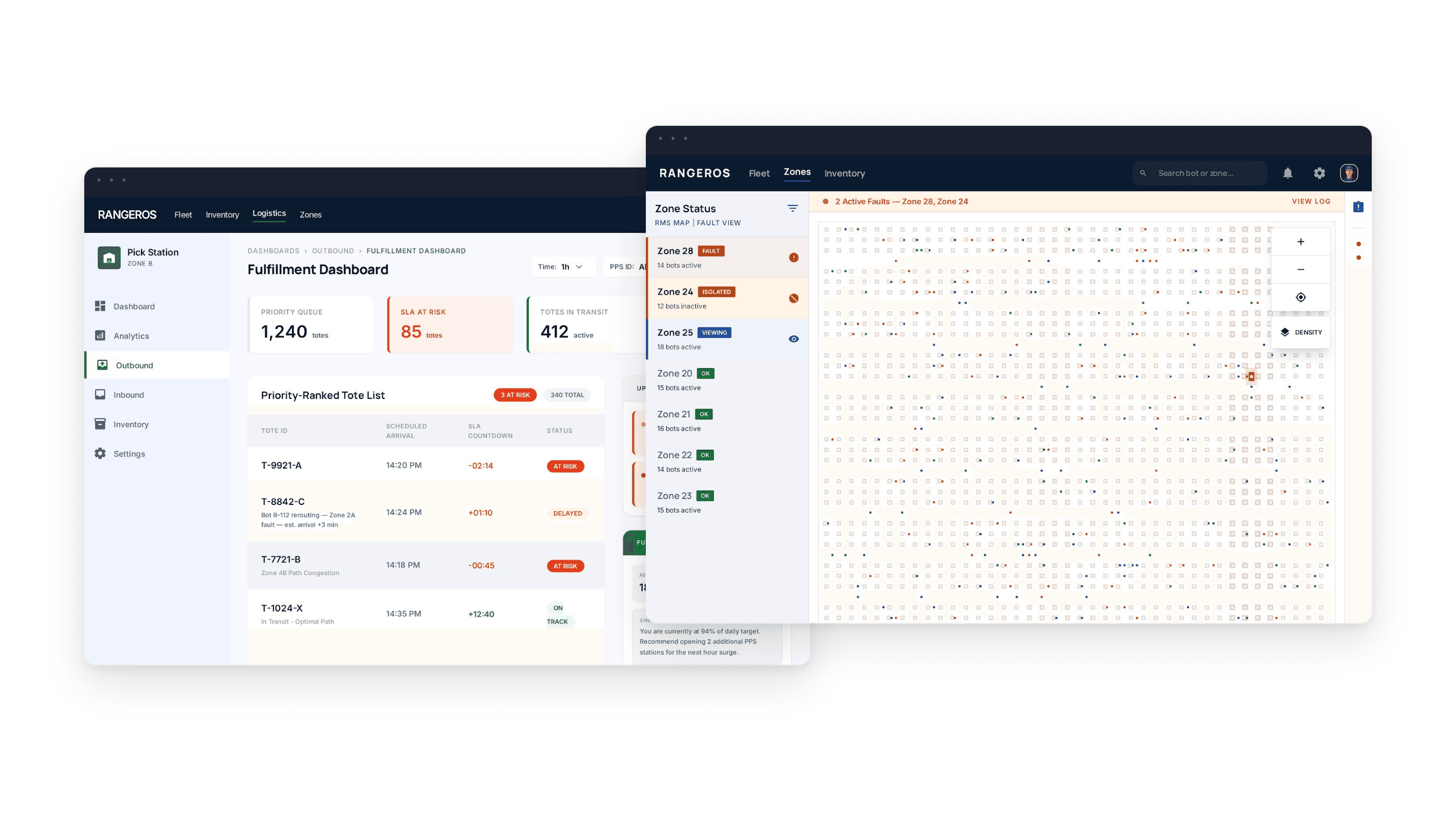
When a Ranger bot malfunctions mid-operation, a technician needs to find it fast, understand the error, and resolve it — without shutting down the entire floor. The original system made all three steps harder than they needed to be.
01
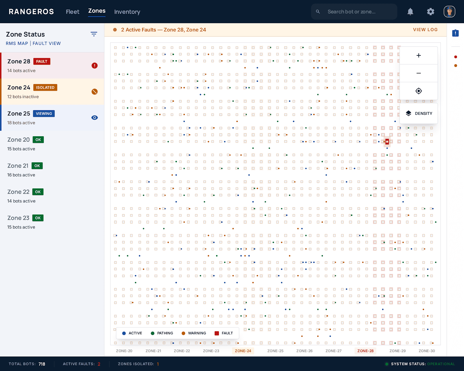
No zone-level fault isolation
The entire floor had to be paused for one faulty bot — catastrophic throughput impact.
02
Broken bot invisible on map
700+ identical squares on a grid. No way to spot a broken one at a glance.
03
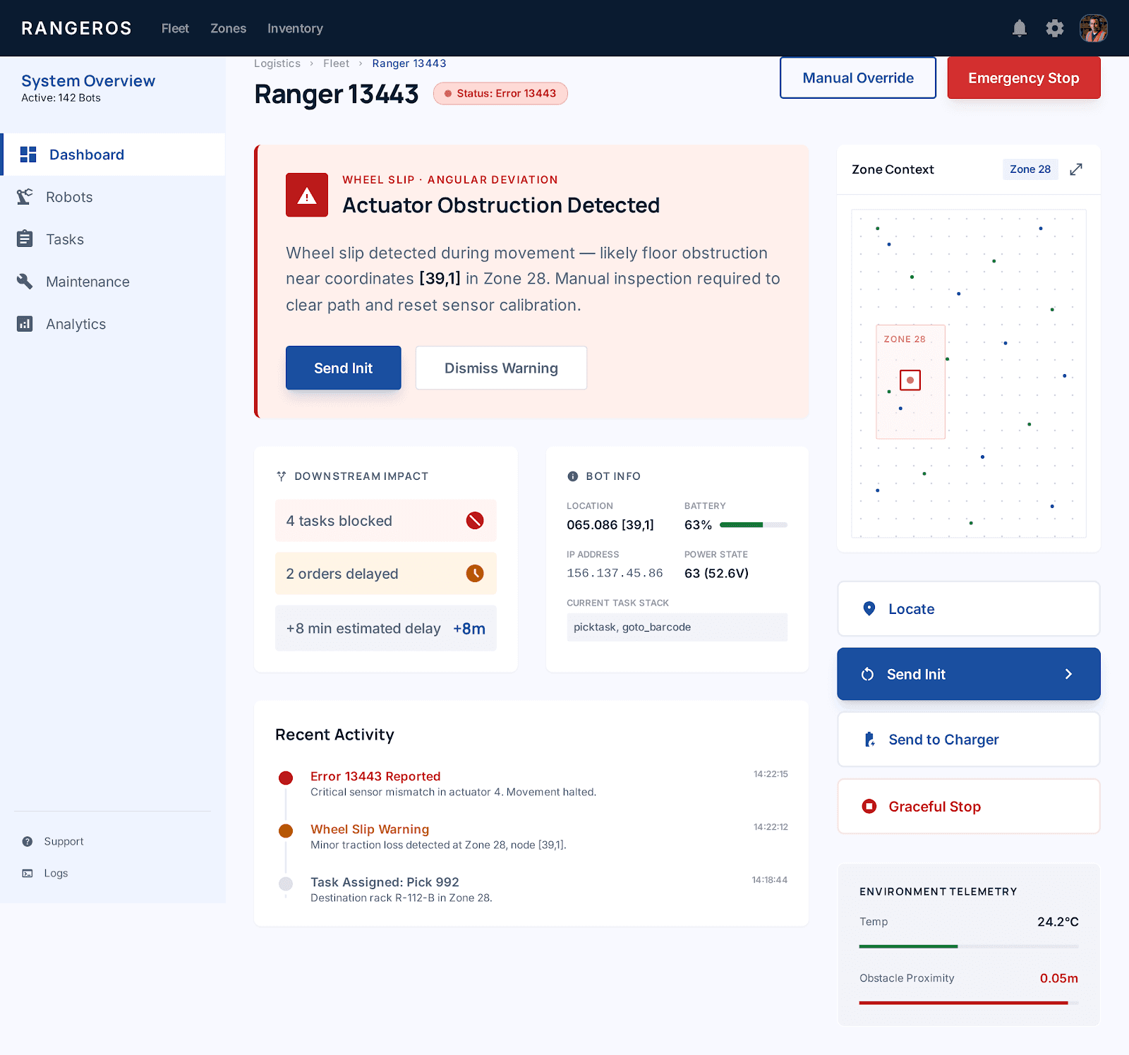
Raw technical error strings
"Main_Error: Large Angular Deviation" — no context, no guidance, no plain English
04
Travel paths not visible
Bot path obstructions couldn't be understood from the map — no visual diagnosis possible.
05
No downstream impact shown
Impossible to triage by business impact — technicians had no view of affected orders.
01
Zone-based fault isolation
A fault pauses only the affected zone. Other 34 zones continue running uninterrupted.
02
Red outlined bot + pulsing badge
Faulty bot shows a red border and pulsing error badge — visible immediately at full-floor zoom.
03
Plain-English errors + actions
"Wheel slip at [88,1] — check floor surface. Suggested: Send Init or move to maintenance.
04
Path overlay toggle on map
Toggle intended vs actual travel paths to visually diagnose deviations and obstructions.
05
Downstream task impact panel
"Blocking 4 tasks · Delaying 2 orders" — triage by business impact, not just fault type.
Old Experience
Bot Fault
Alert fires
Pause Floor
All 700+bots stop
Find the bot
Scan tiny grid
Read error
No guidance
Resume floor
Major downtime lost
Redesigned Experience
Bot fault
Zone auto-isolated
Spot the bot
Red outline, instant ID
Go to zone
Others still running
Read plain error
"Wheel slip at {88,1}"
Fix+resume
Minimal downtime
↓70%
Workflow 2
GreyOrange's warehouse management system runs 20 hours a day, shutting down only between midnight and 4am. The fleet runs two bot types — RMS bots for picking, available in small and large rack sizes, and RTP bots for sorting and transport. With 700+ bots active on a single floor, the cost of poor UX isn't a design problem. It's a throughput problem.
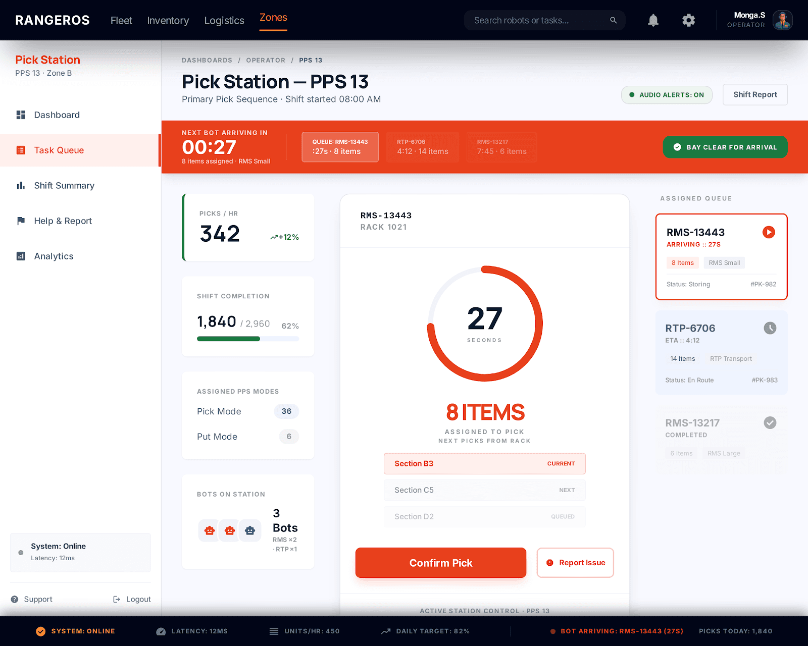
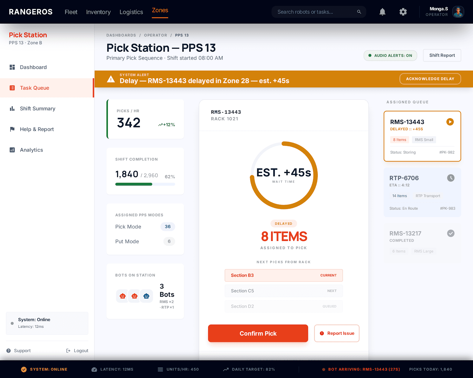
01
No Bot arrival time visible
Operators had no ETA — they stood idle or rushed, unable to pace their work
02
No assigned item count shown
How many items are coming? Unknown, Operators couldn't mentally prepare
03
Delays not explained
When one bot blocked another's path, the operator had no idea, they just waited
04
No accessibility features
All alerts were visual-only in a high-noise environment. HoH operators completely unserved
05
Weak Visual hierarchy
All data at equal weight.Poor contrast on warehouse monitors. No clear reading order
01
Bot Arrival countdown + queue
Persistent "Next bot in 27s" with a mini-queue showing upcoming bots and item counts
02
Items-assigned badge per bot
Each queues bot shows item count prominently so operators can pace and prepare
03
Inline delay reason + source
"Bot 13443 clocking path in Zone 28 - est.45s - contextual, no supervisor call needed
04
Configureable audio feedback
Audio cues for bot arrival, delays, and task completion - configurable per operator preferance
05
Bot Arrival countdown + queue
XL for critical KPIs, M for context, S for metadata. High contrast tested for monitor glare
Old Experience
Wait for bot
No ETA Visible
Bot Arrives
Items buried in UI
Delay Occurs
No Explanation
Call Supervisor
Find out why
New Experience
Visible countdown
"Next bot: 27s"
Items visible
Clear item count
Delay Flagged
"Bot 13443, Zone 28"
No call needed
Self-service info
Workflow 3
Fulfilment staff are the final step before an order ships. But they had no prioritisation, no upstream visibility, and no way to know which totes were at risk until it was too late. Once the truck left, the order was gone. The redesign gave them a complete operational picture — what's coming, what's at risk, and what needs to go first.
01
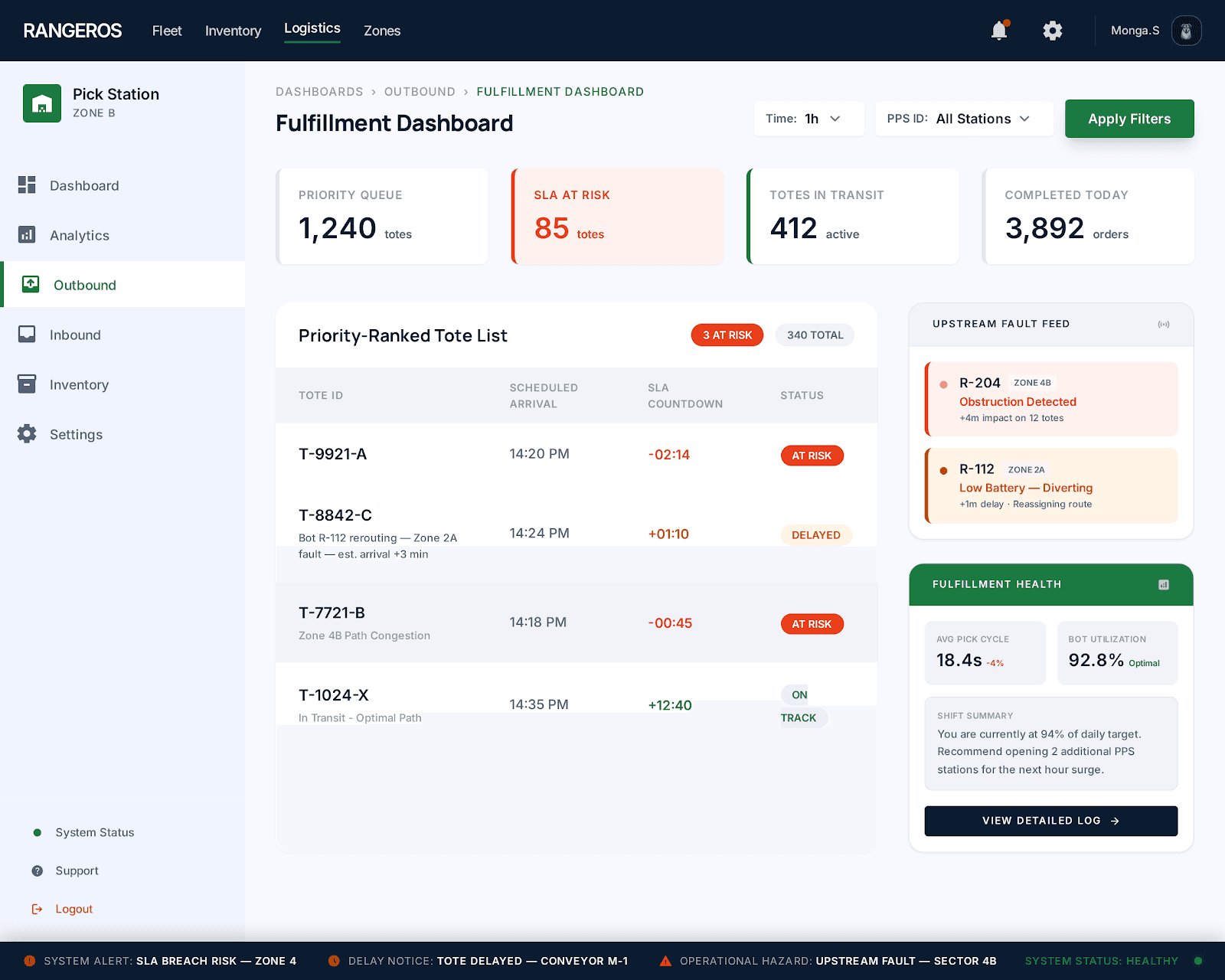
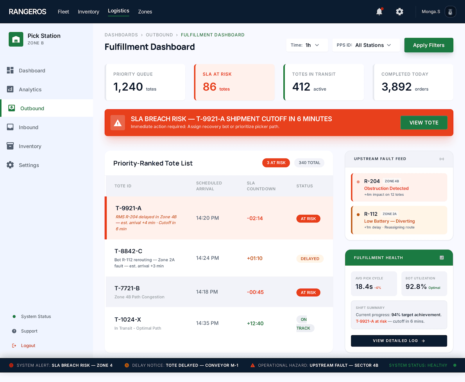
No tote prioritisation
All totes looked equal. Staff had no way to know which order was SLA-critical and which could wait.
02
No upstream visibility
Fulfilment staff were the last to find out — after the delay had already hit them.
03
No shipment consequence tracking
No view of which totes were at risk of missing the truck. Staff couldn't act on what they couldn't see.
04
No handoff context
When a tote arrived late or incomplete, staff had no explanation.
01
Priority-ranked tote queue
Totes sorted by urgency. SLA-at-risk orders flagged clearly so staff always know what goes first.
02
Items-assigned badge per bot
Staff know about delays before they happen, not after.
03
SLA risk indicators
At-risk orders flagged in red so nothing gets missed.
04
Configureable audio feedback
Every delayed tote shows reason, and estimated arrival. Staff have the clarity without calling anyone.
Old Experience
Tote expected
No ETA, No priority
Tote missing
No reason shown
Call supervisor
Ask questions
Wait
Idle time
Shipment leaves
Order likely missed
New Experience
See full queue
Ranked by urgency
Priority clear
SLA risk visible
Risk flagged
"Bot rerouting +3m"
No calls
Self-service info
Shipment met
Fulfillment rate up
Going on site changed everything. The real problems were never in the brief, they were in the gaps between what people said they needed and what I saw them actually doing.
Designing for a live warehouse with no room for error taught me that good design isn't just about the interface. It's about understanding the consequences of getting it wrong for the people who depend on it every shift.
Designing for a live warehouse with no room for error taught me that good design isn't just about the interface. It's about understanding the consequences of getting it wrong for the people who depend on it every shift.
The biggest lesson, enterprise users are experts. They don't need things simplified. They need things made clear.
Whether you want the full story... or Just want to say Hello
I'd Love to hear from you